Improving cross-platform consistency in device previews for audio professionals

B2B
Design System
Company
Role
Timeline
Tools
With
Shure, an audio hardware and software company
Product design,
UX research
5 weeks
Figma
PMs, Devs

Summary

I unified the device preview feature across three Shure platforms: Wireless Workbench, Designer, and Device Management, so both intermediate and expert professional users can quickly spot what matters in two key workflows: setup and monitoring. The component uses a consistent skeleton (info, status, asset, actions) and adapts by workflow context.

What is Device Preview

The device preview component serves as a compact summary of an audio device’s state, designed to help users triage, monitor, or configure within different workflows. Across platform, device preview aims to 4 different slots of information:

❶ Text slot for information
❷ Statuses slot for surface states and alerts
❸ Asset slot for device image
❹ Action slot for interaction
Final design for device preview in Designer

Business goals

• Strengthen product cohesion
• Support scalability
• Reduce long-term maintenance cost

User goals

• Quickly triage what matters most to take appropriate actions
• Reduce learning curves through a consistent design

Constraints

• Limited existing research on users need for device preview in different platforms
• Products wanted to add more features midway through the process

KPIs

• Time to spot critical issue
• User satisfaction scores
• Adoption of the device preview component
User group

Three Platforms, Two Workflows

Our users are intermediate and expert audio professionals: radio frequency engineers, system integrators, IT admins, and rental staff.
Across Shure products, the device preview supports two core workflows.

Setup: preparing devices for shows in Wireless Workbench, configuring rooms with devices in Designer, and ensuring device health in Device Management.

Monitoring: spotting and responding to time-critical issues during live events in Wireless Workbench.
Problem

One Component, Three Designs

Because of different needs across platforms, the device preview — a small but critical component — had fragmented patterns across platforms, leading to 2 systemic problems, which leads to higher maintanence costs.
Problem 01: Slow triage because of hidden important issues
For example, in Designer, critical alerts only appeared on hover, forcing users to spend extra time clicking or hovering to reveal.
Problem 02: Inconsistent mental model
Different patterns across platforms forced multi-app users to relearn the UI, raising cognitive load.

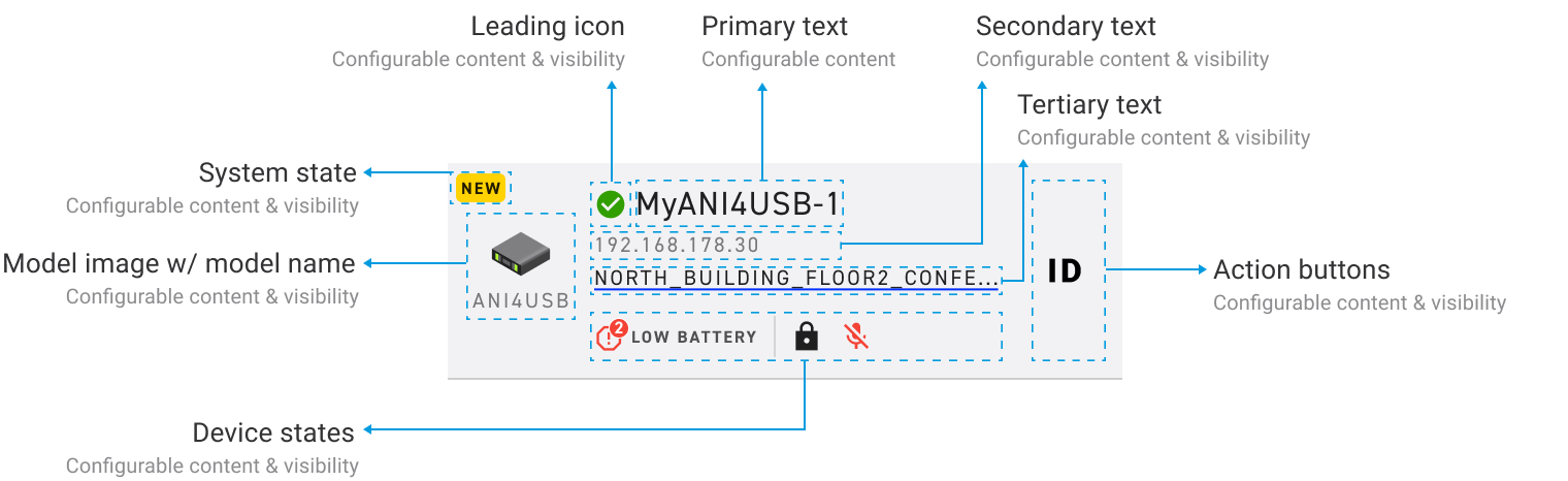
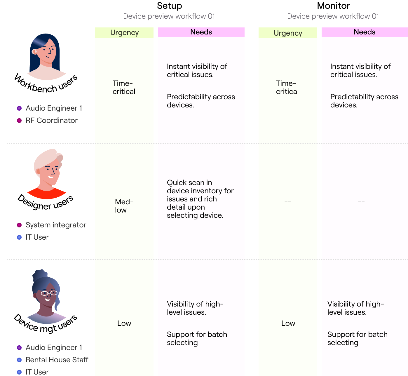
"How might we design a single, flexible device preview that surfaces urgency first and adapts by context, SO THAT..."

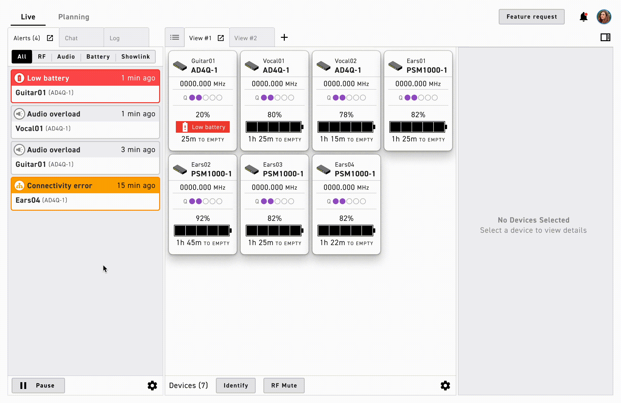
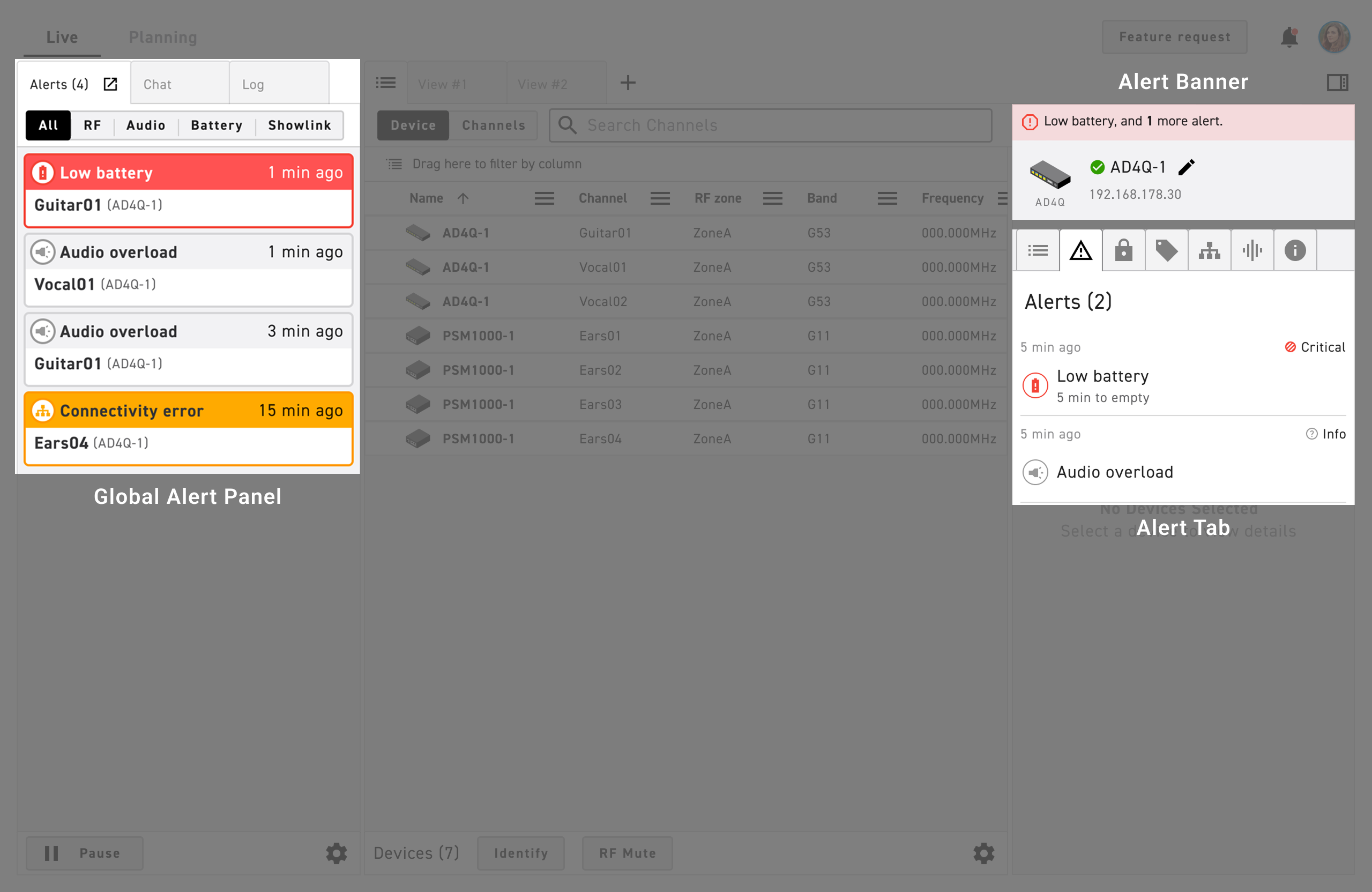
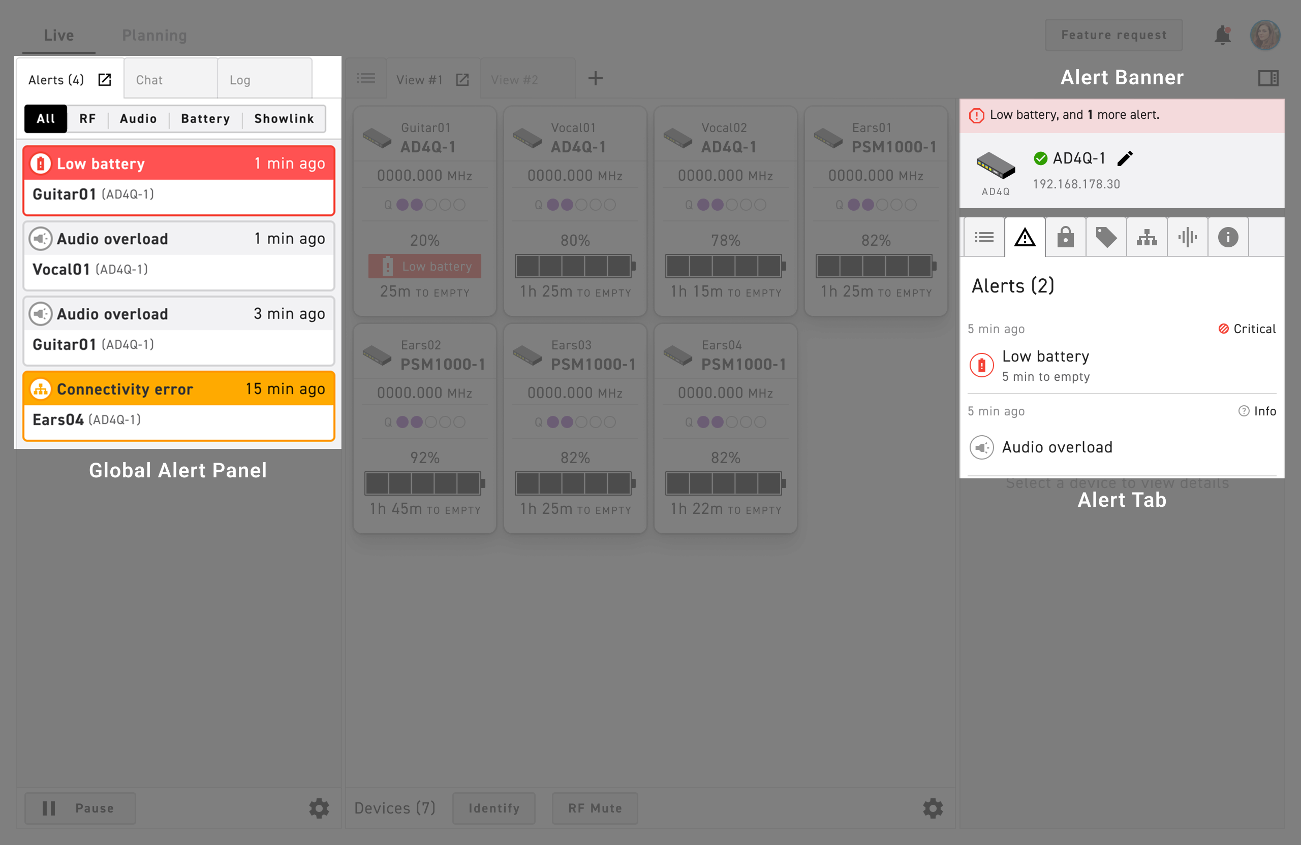
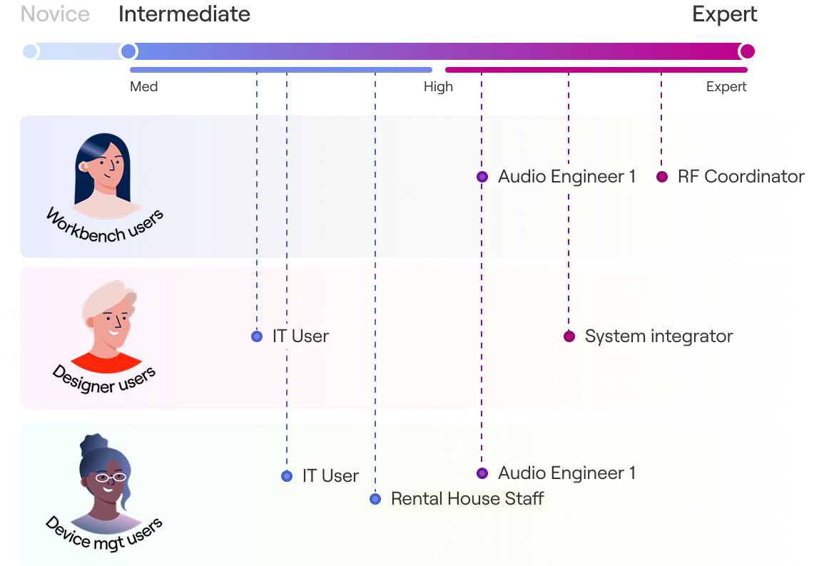
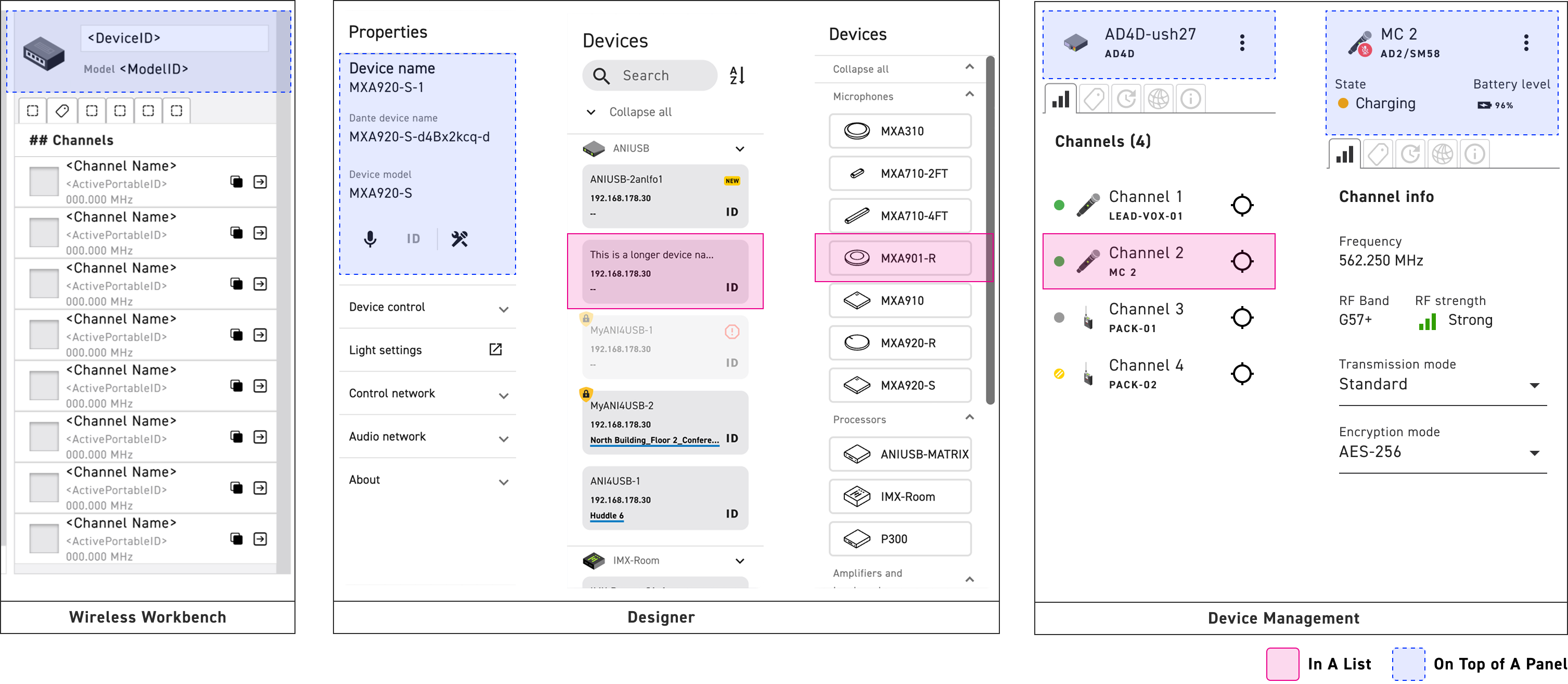
Wireless Workbench users could see critical issues immediately during setup and monitoring when seconds matter.

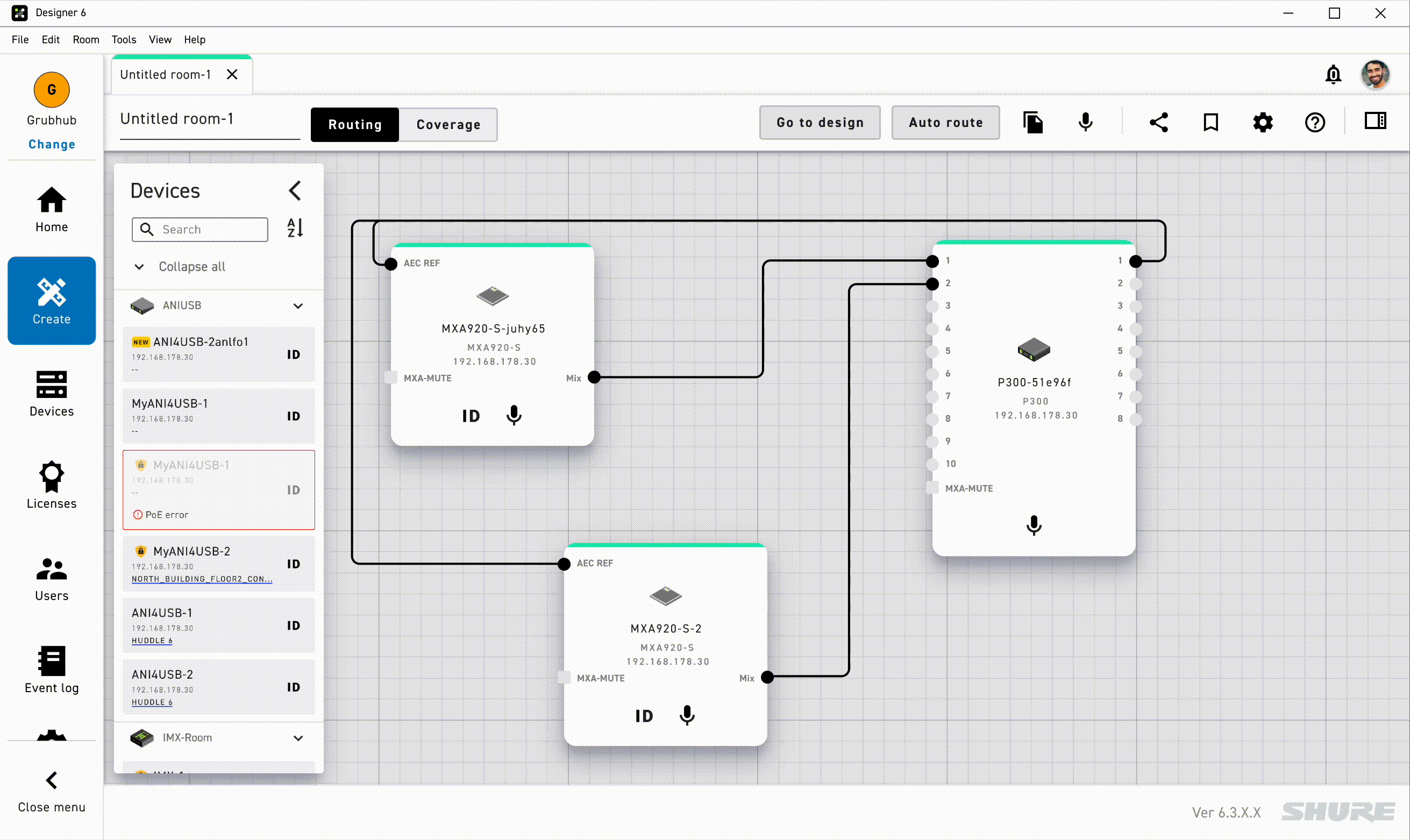
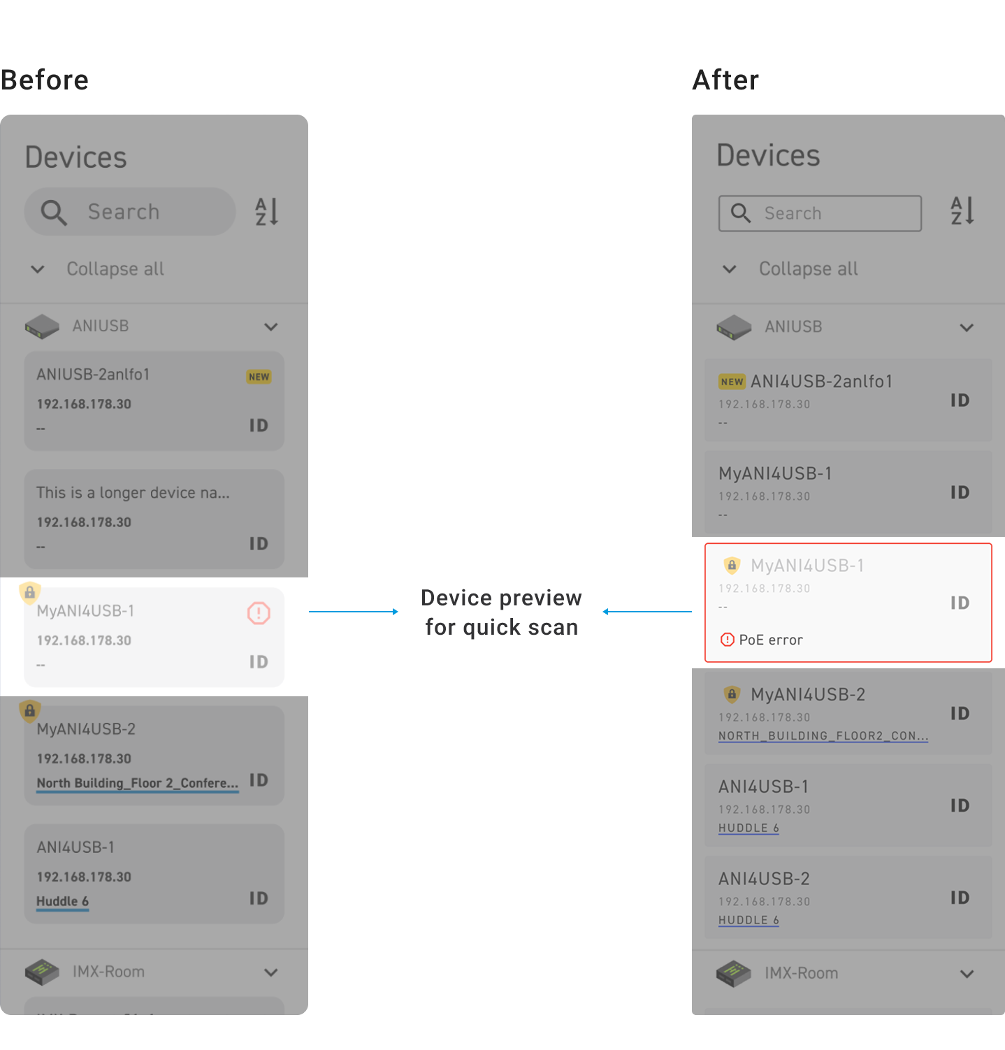
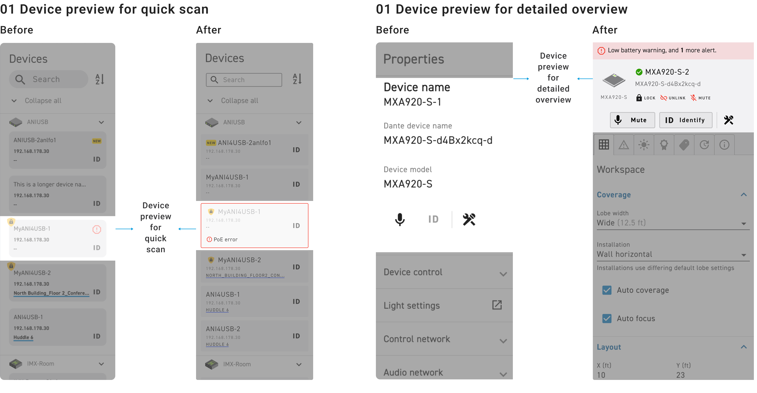
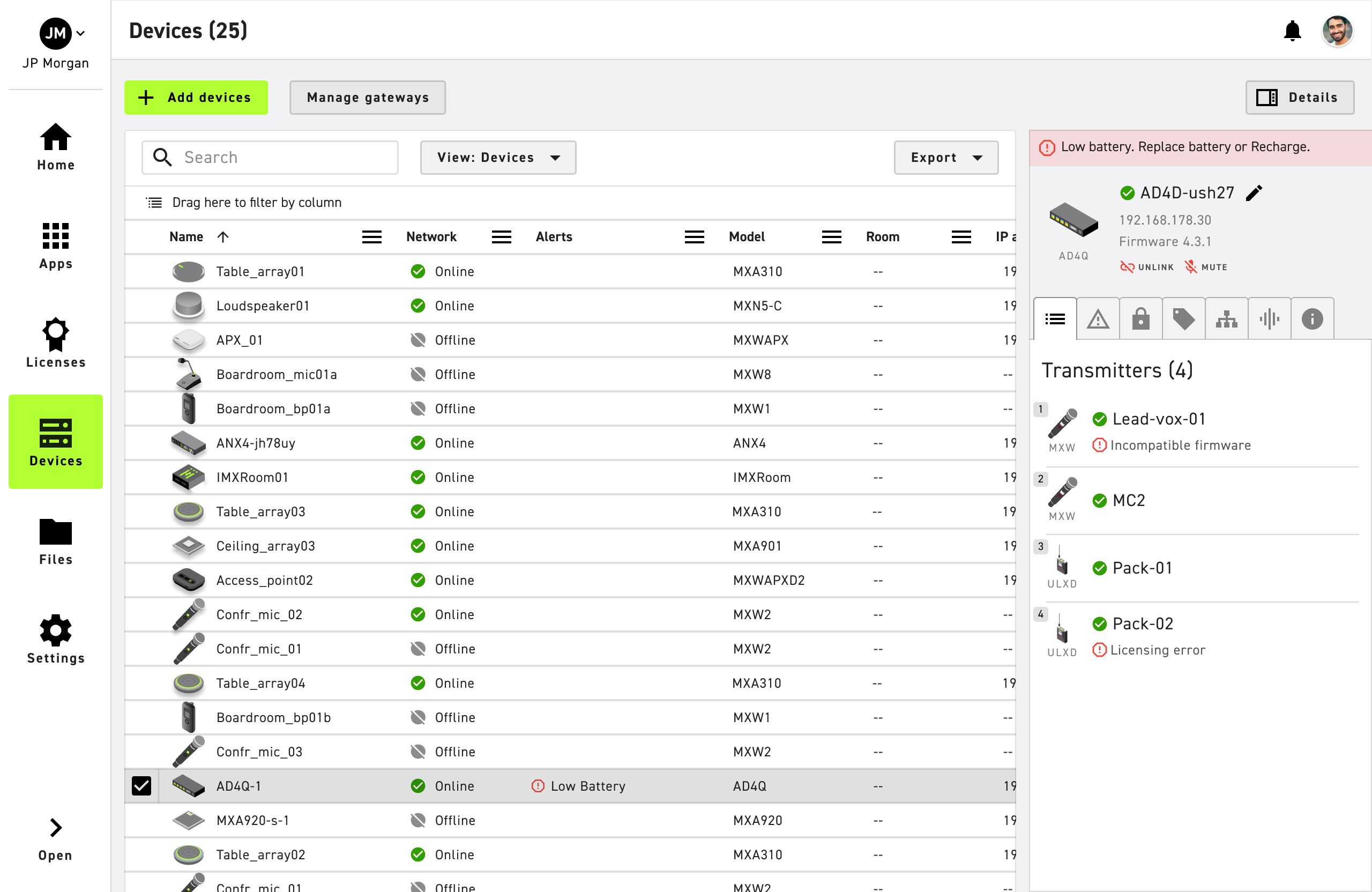
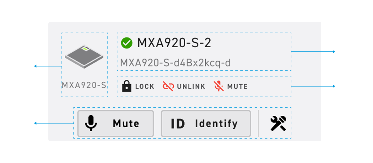
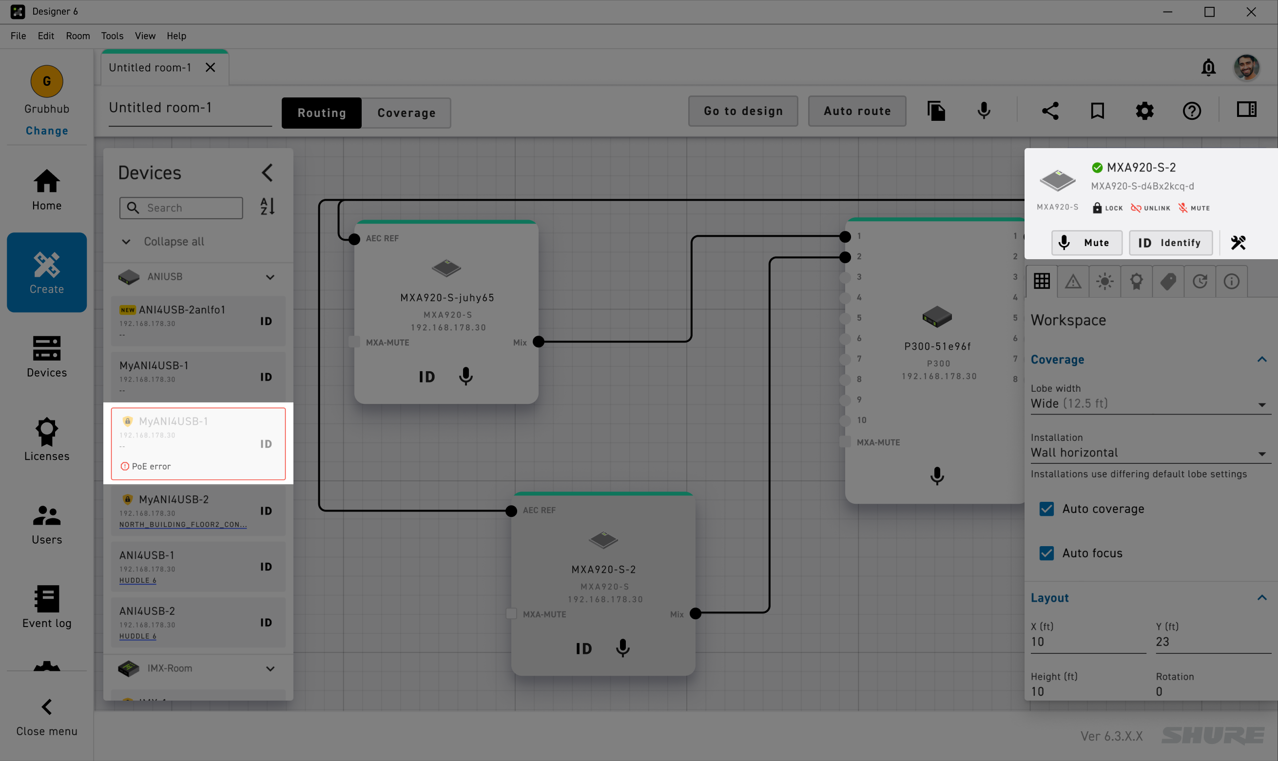
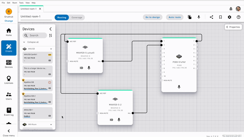
Designer users can spot issues in device inventory and get richer context on selection to complete routing and coverage quickly.

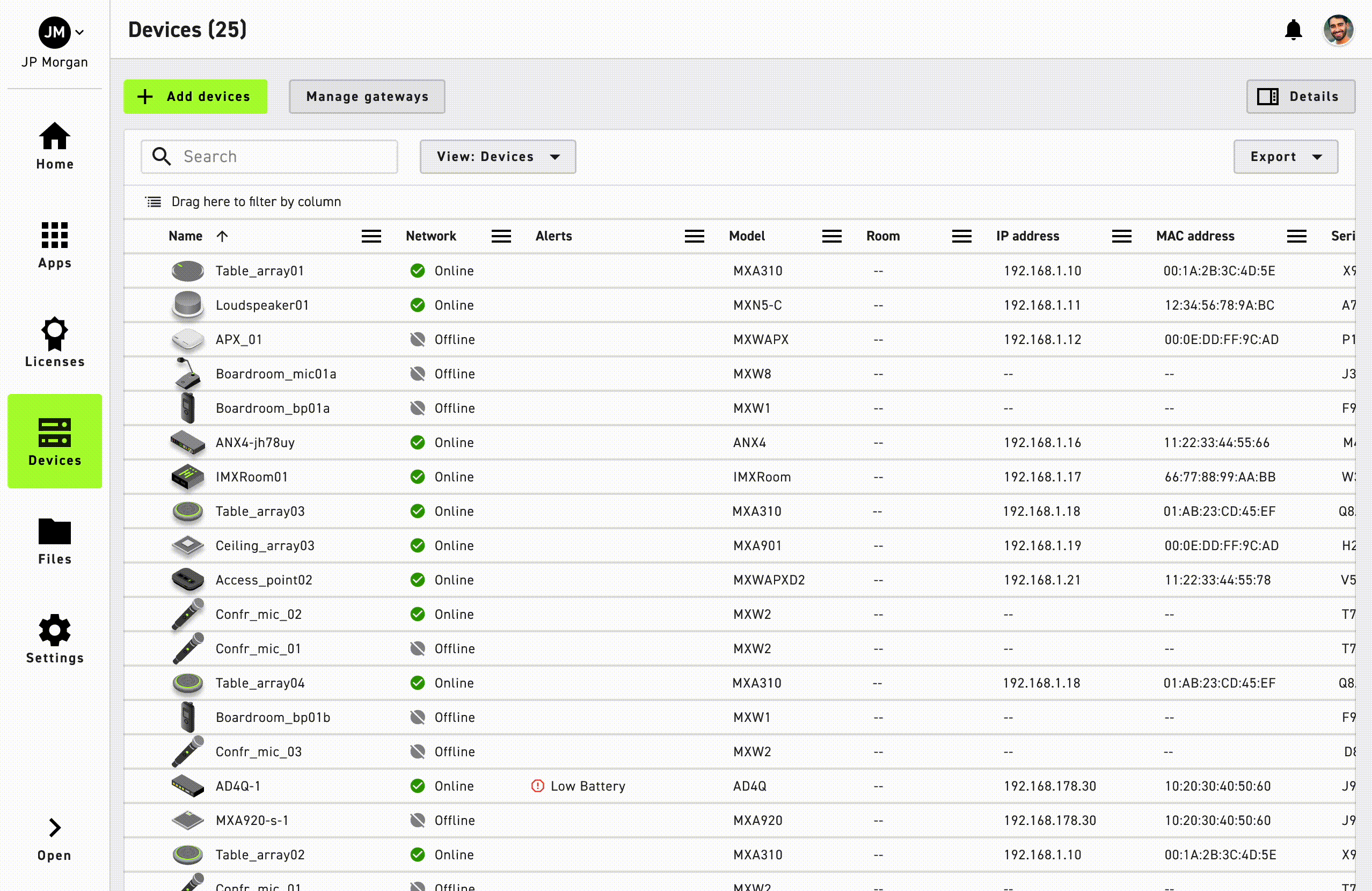
Device Management users can visualize high level status and apply bulk actions to maintain device fleet at scale.

Solutions

A consistent device preview that adapts to setup and monitoring across 3 different Shure platforms.

01 API design for device preview on top of the panel
02 API design for device preview in the list

Wireless Workbench: A device preview that helps users spot critical information when setup & monitoring within 3 secs

In research, we found that Workbench users expect to scan device information quickly during both setup and live monitoring, focusing only on time-critical issues. In a live show, even a few seconds of delay can have serious consequences.
I introduced urgency-based grouping to surface time-critical issues that helps users triage critical issues within 3 secs.
To support time critical actions in setup, I paired this with a system of alert banner, global alert panel, and alert tab, creating an ecosystem where issues are immediately visible and directly actionable.
I did the same thing for live monitoring that aligns with users' expectation for seeing matching patterns with low learning curves.  

Designer: A device preview that adapts to workflow, from quick scan to detailed overview.

From 5 user research sessions, we identified two key use cases for device preview in the room setup workflow: the need to see critical information at a glance (quick scan) and the need for a richer, detailed overview.
Problem 01: Quick scan, but blocked by hover
Users need a quick scan of critical issues from the device inventory before routing. The current preview compresses multiple statuses into one slot and hides detail behind hover, adding extra steps to confirm priority.
Problem 02: Detailed overview, but lacks context
After selection a device, users expect a richer, contextual overview in the side panel, but the current preview leaves out context needed for smooth configuration.
I designed with flexibility for context-driven device preview that aligned with each use case, and 5 out of 5 participants quickly recognized the intended hierarchy and could describe the device state without extra clicks.
Quick scan: Urgency-ordered alerts are visible without hover, so users can identify and troubleshoot their devices quickly with ease.

Detailed overview: The preview expands into a detailed overview with clear hierarchy of alerts, states and linked actions to configuration.

Device management : A device preview that adapts to changing requirements with equal transmitter and receiver visibility

Through 5 research sessions, we found that in device management, users only expect to quickly scan through their device previews.
Problem 01: Imbalance between transmitter and receiver preview
Research also showed the current preview overweighted transmitters, while receiver information were underexposed.
Problem 02: Color-only status is ambiguous
When users quickly skim through devices in the list, the status indicator relied only on color, so users couldn’t tell which issue was present at a glance and had to click into details.
I balanced transmitter & receiver scannability, where users reported faster identification of device issues of both transmitter and receiver through consistent pattern.
Takeaways

What I learned...

① Design for context, not silos.
It’s essential to understand the context in which a component will be used. We don’t need to design a different component for every user group—instead, we should create flexible patterns that can adapt to diverse use cases across different workflows and products.

② Collaboration moves solutions forward.
Progress depends on being open and collaborative, especially in cross-functional teams. Designing effective solutions often requires learning how to leverage the expertise of others and working together to turn design intent into scalable outcomes.